Ready to transform your videos from drab to fab? Unlock the secrets of professional-looking color grading with this guide to KineMaster and CapCut! We’ll dive into the fundamentals, explore advanced techniques, and tackle common color grading headaches. Whether you’re a seasoned editor or just starting out, get ready to elevate your video game with stunning visuals that’ll leave your audience mesmerized.
From mastering white balance to harnessing the power of LUTs (Look-Up Tables), we’ll cover everything you need to know to achieve consistent, stunning results across different devices. We’ll compare and contrast the features of both KineMaster and CapCut, helping you choose the best tools for your workflow. Prepare for a journey into the vibrant world of color grading – let’s get started!
Understanding Color Grading Fundamentals in KineMaster and CapCut

Color grading is the art of manipulating the colors in your video to enhance mood, create a specific look, and improve the overall visual appeal. It’s more than just making things brighter or darker; it’s about crafting a visual narrative that complements your story. In KineMaster and CapCut, mastering color grading elevates your videos from amateur to professional.
The Importance of Color Grading in Video Editing
Effective color grading significantly impacts viewer engagement. A well-graded video looks polished and professional, immediately enhancing its credibility. Consistent color palettes create a cohesive visual experience, guiding the viewer’s eye and improving storytelling. Conversely, poorly graded footage can appear dull, amateurish, and distracting, detracting from the overall message. Think of a film noir – the dark, shadowy tones are integral to the genre’s atmosphere and storytelling. Color grading helps achieve this kind of deliberate stylistic choice.
Basic Color Correction Tools in KineMaster and CapCut
Both KineMaster and CapCut offer a range of basic color correction tools. These tools typically include adjustments for brightness, contrast, saturation, and sometimes hue and shadows/highlights. These fundamental adjustments form the basis for more advanced color grading techniques. For instance, adjusting the brightness can compensate for underexposed footage, while contrast helps define details and depth. Saturation controls the intensity of colors, while hue shifts the overall color temperature.
Color Grading Workflows: KineMaster vs. CapCut
While both apps provide color correction tools, their workflows differ slightly. KineMaster often presents its tools in a more linear fashion, with individual adjustments made sequentially. CapCut, on the other hand, may offer a more intuitive, sometimes more visually driven interface, potentially allowing for quicker adjustments and previews. The best workflow depends on individual preference and the complexity of the grading task. For simple corrections, CapCut’s ease of use might be preferable. For more intricate adjustments, KineMaster’s detailed control could be advantageous.
Setting White Balance in KineMaster and CapCut
Accurate white balance is crucial for realistic color representation. In both apps, the process typically involves selecting a white or neutral-colored area in the footage as a reference point. The software then adjusts the color temperature to ensure that white appears white and other colors are accurately represented. This step is usually done early in the editing process, before other color adjustments are applied. A consistent white balance throughout a video prevents jarring shifts in color temperature between different shots. Failure to set white balance correctly can lead to a video that looks unnaturally warm or cool, detracting from its overall quality.
Comparison of Color Adjustment Tools
| Tool | KineMaster | CapCut | Notes |
|---|---|---|---|
| Brightness | Slider adjustment, usually with a preview | Slider adjustment, often with a real-time preview | Both offer precise control |
| Contrast | Slider adjustment | Slider adjustment | Enhances the difference between light and dark areas |
| Saturation | Slider adjustment | Slider adjustment | Controls the intensity of colors |
| Hue | May be available as a separate adjustment or within a color wheel | May be available as a separate adjustment or within a color wheel | Shifts the overall color temperature |
Advanced Color Grading Techniques
Unlocking the full potential of your videos in KineMaster and CapCut goes beyond basic adjustments. Mastering advanced color grading techniques allows you to craft a specific mood, enhance storytelling, and elevate your visual aesthetic. This section delves into the powerful tools available in both apps to achieve professional-looking results.
Color Wheel Manipulation and Presets
Both KineMaster and CapCut offer intuitive interfaces for color grading, incorporating color wheels that visualize the relationships between hues, saturation, and brightness. In KineMaster, the color wheel allows for precise adjustments to individual color ranges, enabling targeted color correction and creative stylistic choices. CapCut’s color wheel provides similar functionality, often with preset filters that offer a starting point for various looks. Experimenting with the color wheel involves understanding how shifting hues can drastically change the overall feeling of a video. For example, shifting the overall color temperature towards warmer tones (oranges and yellows) can create a cozy, nostalgic feel, while cooler tones (blues and greens) might evoke a sense of calmness or mystery. Presets in both apps provide quick access to common color grading styles, serving as a great foundation for further customization.
Color Palette Impact on Video Mood and Tone
The strategic selection of a color palette significantly influences the emotional response to your video. A predominantly warm palette, rich in reds, oranges, and yellows, can convey feelings of energy, excitement, or warmth. Conversely, a cool palette using blues, greens, and purples can establish a sense of tranquility, serenity, or even melancholy. Muted tones, characterized by lower saturation, often create a more subdued and sophisticated atmosphere, while vibrant, highly saturated colors produce a dynamic and energetic effect. Consider the genre of your video: a vibrant palette might be perfect for a travel vlog, while a more muted palette could suit a documentary or corporate video. Understanding this relationship is crucial for creating videos that effectively communicate their intended message.
Creating Specific Color Grading Styles
Let’s explore how to achieve three distinct color grading styles: cinematic, vintage, and vibrant.
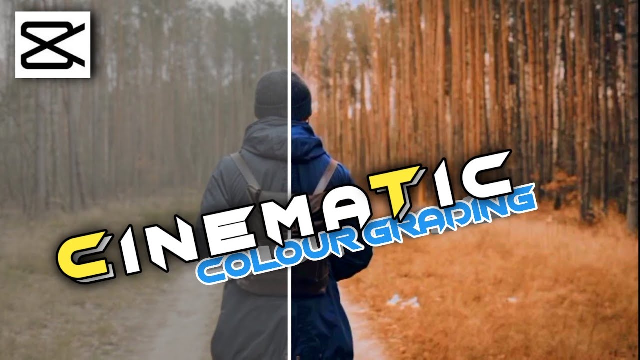
Cinematic Color Grading
To achieve a cinematic look, aim for deep, rich colors with subtle contrast. In both KineMaster and CapCut, reduce the overall brightness slightly, increase contrast subtly, and selectively adjust the shadows and highlights to add depth. Focus on using a limited color palette with deep blues, warm oranges, and muted greens. Adding a slight vignette can further enhance the cinematic effect.
Vintage Color Grading
For a vintage feel, emulate the look of old film stock. In both apps, reduce saturation slightly, increase contrast, and add a slight grain effect. Use warmer tones, with a slightly desaturated yellow or orange cast. Experiment with adding a subtle color bleed effect to further enhance the vintage aesthetic.
Vibrant Color Grading
To achieve a vibrant style, boost the saturation significantly. Increase the brightness and contrast, but be mindful of not overdoing it, to avoid a washed-out look. Use a wide range of colors, but ensure they are well-balanced to avoid a chaotic appearance.
Effective Color Grading Techniques for Various Video Genres
Different video genres benefit from distinct color grading approaches.
Landscape Videos
Landscape videos often benefit from a color grading style that enhances the natural beauty of the scene. Use subtle adjustments to boost saturation and contrast, focusing on highlighting the key colors in the landscape. A slightly warmer color temperature can often improve the overall mood.
Portrait Videos
Portrait videos often benefit from a more flattering color grading approach. Focus on skin tone correction and enhancing the subject’s features. Use softer lighting and subtle color adjustments to create a more natural and pleasing aesthetic.
Vlog Videos
Vlogs often benefit from a vibrant and energetic color grading style. Boost saturation and contrast to make the video more visually engaging. Consider using a consistent color palette throughout the vlog to create a unified look and feel.
Before-and-After Color Grading Examples
| Before | After (Cinematic) | After (Vintage) | After (Vibrant) |
|---|---|---|---|
| A description of a before image: A landscape shot of a forest, slightly dull and washed out in color. The greens are muted, and the overall image lacks contrast. | A description of the cinematic after image: The same forest shot, now with deep, rich greens and blues. Contrast is increased, adding depth. Shadows are subtly darkened, and highlights are slightly brightened. A slight vignette is added to draw focus to the center. | A description of the vintage after image: The forest shot with reduced saturation, a slight yellow tint, and added grain. The overall image appears warmer and more muted, reminiscent of older film stock. | A description of the vibrant after image: The forest shot with significantly increased saturation and contrast. The greens are intensely vivid, and the overall image is bright and energetic. |
Optimizing Color Grading for Different Screen Types

So, you’ve mastered the art of color grading in KineMaster and CapCut, but your masterpiece looks wildly different on your phone than it does on your friend’s tablet, and completely different again on a professional monitor! Don’t despair, this is a common challenge. The key is understanding how different screens interpret color and adjusting your workflow accordingly. Let’s dive into optimizing your color grading for a consistently stunning visual experience across all devices.
Color grading, while creatively fulfilling, presents unique hurdles when considering the vast array of screen types available. Each device boasts its own unique characteristics—resolution, aspect ratio, color gamut, and brightness—all of which affect how your carefully crafted colors are displayed. A vibrant sunset might appear washed out on a dim phone screen, while rich blacks could look crushed on a high-dynamic-range (HDR) monitor. Therefore, a standardized approach to color grading that accounts for these variations is crucial.
Screen Resolution and Aspect Ratio Influence on Color Grading
Different screen resolutions and aspect ratios directly influence how your video’s pixels are displayed. A high-resolution screen (like a 4K monitor) will reveal more detail in your image, including subtle color gradations. A lower-resolution screen, on the other hand, might appear softer or lose some of the fine details in your color work. Similarly, the aspect ratio (the relationship between the width and height of the screen) can affect the overall composition and the perceived color balance. A widescreen aspect ratio might stretch or compress the image, subtly altering color perception. To address this, consider creating your color grade with the lowest resolution you anticipate your audience using, this will ensure that your grade will look good across all resolutions. Then, upscale it for higher resolutions to maintain consistency.
Achieving Consistent Color Across Platforms
Consistency is king when it comes to color grading across different platforms. The goal is to ensure that your video’s colors look as intended regardless of the viewing device. This involves understanding and accounting for the differences in color gamut (the range of colors a device can display). Some devices have a wider gamut than others, meaning they can display a broader range of colors. A color that looks perfect on a device with a wide gamut might appear dull or oversaturated on a device with a narrower gamut. To ensure consistency, you should aim for a color grade that works within the smaller gamut, ensuring that your colors are correctly represented across all devices.
The Importance of Color Space
Color space is the method by which colors are numerically represented. Common color spaces include sRGB (standard for the internet) and Rec.709 (standard for HDTV). Choosing the right color space is critical because different color spaces have different color gamuts. If you grade in a wide gamut color space like Adobe RGB and then export in sRGB, you may lose some of the vibrancy. Using a color space that aligns with your target platform will help ensure color accuracy. For web videos, sRGB is generally recommended, while Rec.709 is often preferred for television broadcasts.
Best Practices for Consistent Color Across Devices
Achieving consistent color across various devices requires a strategic approach. Here are some essential best practices:
- Target a common color space: Choose a color space (like sRGB or Rec.709) that’s widely supported across different devices and platforms.
- Calibrate your monitor: A calibrated monitor ensures that the colors you see on your screen are accurate and consistent.
- Grade for the lowest common denominator: Start by grading your video for the device with the smallest color gamut. This ensures that your colors will be visible on all devices.
- Test your video on multiple devices: Before finalizing your grade, view your video on various devices (phones, tablets, computers) to check for color inconsistencies.
- Use a color management system (CMS): A CMS helps manage and maintain color consistency throughout the entire workflow, from editing to final output.
- Utilize reference images: Using reference images with known color values can help maintain consistency across different devices.
Working with Color Grading LUTs (Look-Up Tables)
LUTs, or Look-Up Tables, are pre-designed color profiles that dramatically speed up and simplify your color grading workflow in both KineMaster and CapCut. They offer a quick way to achieve consistent and professional-looking results, saving you significant time and effort compared to manually adjusting individual color parameters. Think of them as pre-set filters, but far more nuanced and powerful.
LUT Import and Application in KineMaster and CapCut
Importing and applying LUTs varies slightly between KineMaster and CapCut. In KineMaster, you typically import the LUT file (usually a .cube or .3dl file) into your project’s assets. Then, you’ll find a LUT adjustment layer or effect within the effects menu; select your imported LUT and adjust its intensity as needed. CapCut’s process is similar. You’ll import the LUT file into your project’s assets (often accessible through the ‘Import’ function). CapCut may offer a dedicated LUT filter or effect, which you can then apply to your clip(s) and adjust the strength. Both apps often allow for blending the LUT effect with your existing color grading, allowing for more creative control.
LUT Workflow Comparison: KineMaster vs. CapCut
While both apps support LUTs, their integration differs slightly. KineMaster’s LUT implementation might offer more granular control over the blending mode and intensity of the LUT, potentially offering more advanced adjustments. CapCut, on the other hand, might provide a more streamlined and intuitive interface for applying LUTs, making it easier for beginners to use. Ultimately, the best choice depends on your familiarity with each app and your specific project requirements.
Creating Custom LUTs
Creating your own LUTs allows for complete control over your color aesthetic. While both KineMaster and CapCut don’t directly offer built-in LUT creation tools, you’ll need a dedicated LUT creation software. Popular options include Adobe Lightroom, Photoshop, DaVinci Resolve, and others. These applications allow you to meticulously adjust color curves, saturation, and other parameters to generate a custom LUT file that you can then import into KineMaster or CapCut. The process generally involves adjusting the colors of a reference image or video and then exporting the resulting color profile as a LUT file.
Examples of LUT Styles and Their Visual Effects
Different LUTs create vastly different moods and aesthetics.
| LUT Style | Visual Effect |
|---|---|
| Film Emulation (e.g., Kodak Portra) | Warm, saturated colors with soft highlights and shadows, mimicking the look of classic film photography. Think rich skin tones and a slightly dreamy atmosphere. |
| Vintage/Retro | Muted colors with increased contrast and a faded, nostalgic feel. Often features desaturated greens and blues, with warmer tones dominating. |
| Modern/Clean | Bright, crisp colors with high contrast and vibrant saturation. This style aims for a clean, contemporary look, often seen in fashion and product videos. |
| Dramatic/Moody | Deep shadows, rich blacks, and desaturated colors, creating a dark and atmospheric mood. Often features strong contrast and a cool color temperature. |
| Teal and Orange | A classic cinematic style featuring cool teal tones in the shadows and warm orange tones in the highlights. This creates a dramatic and visually striking effect. |
Troubleshooting Common Color Grading Issues
Color grading in KineMaster and CapCut, while incredibly powerful, can sometimes lead to unexpected results. Understanding common pitfalls and how to rectify them is crucial for achieving professional-looking videos. This section will equip you with the knowledge to diagnose and solve frequent color grading problems, transforming your edits from amateur to amazing.
Color Banding
Color banding, the appearance of distinct bands of color instead of smooth gradients, often arises from insufficient bit depth in your video footage or overly aggressive color adjustments. To avoid it, ensure you’re working with high-quality source material (ideally 10-bit or higher). If banding appears, try subtly reducing the intensity of your color grading adjustments, or use a noise reduction tool within your editing software to smooth out the transitions between color bands. Experimenting with different color grading methods, such as using curves instead of solely relying on presets, can also yield smoother results.
Clipping
Clipping occurs when details are lost in the highlights (white clipping) or shadows (black clipping) due to extreme adjustments in brightness or contrast. This results in a washed-out or overly dark look. To avoid this, carefully monitor your histograms in KineMaster or CapCut. The histogram shows the distribution of your colors, and clipping is indicated by areas that are completely white (highlights) or black (shadows). Reduce the intensity of your adjustments in those areas to recover detail. Tools like the “shadows” and “highlights” sliders in these apps allow for targeted adjustments to prevent clipping.
Incorrect White Balance
Incorrect white balance leads to color casts, making your video appear too warm (orange/yellow) or too cool (blue). This is often caused by inconsistent lighting conditions during filming. To correct it, use the white balance tool within your editing software. In KineMaster and CapCut, this usually involves selecting a white or neutral gray area in your video and using the tool to adjust the overall color temperature. Alternatively, you can apply a color temperature adjustment manually, fine-tuning the warmth or coolness until the colors appear natural. Consider using a color picker tool to ensure precise adjustments.
Masking Techniques for Targeted Color Correction
Masking allows you to isolate specific areas of your video for precise color adjustments without affecting the rest of the frame. Both KineMaster and CapCut offer masking tools. These allow you to draw shapes or use keyframes to define the area you want to adjust. For example, you might use a mask to correct the color of a subject’s skin without affecting the background. Experiment with different mask types (e.g., rectangular, elliptical, freehand) and feathering options to achieve seamless transitions between masked and unmasked areas.
Inconsistent Color Grading Across Clips
Maintaining consistent color grading across multiple clips is crucial for a cohesive final product. To ensure consistency, apply your color grade to one clip first and then copy/paste or use the same settings across other clips. If subtle variations remain, adjust the color grading of individual clips slightly to achieve harmony. Using color grading LUTs (Look-Up Tables) can also help maintain a consistent look and feel across all your clips.
Frequently Asked Questions
- Why are my colors muddy after applying a LUT?
- This could be due to a LUT that doesn’t match your footage’s color profile or a conflict with existing color grading adjustments. Try reducing the intensity of the LUT or adjusting your base color grade before applying it.
- How do I fix a green tint in my video?
- This is often a white balance issue. Adjust your white balance settings, potentially adding more warmth (moving the color temperature slider towards warmer colors) to counteract the green tint.
- My highlights are blown out; how do I recover detail?
- This is highlight clipping. Reduce the brightness and contrast settings, and carefully use the highlight recovery tools (if available in your editing software) to bring back detail in the bright areas without affecting the rest of the image.
FAQ Overview
What’s the difference between color correction and color grading?
Color correction fixes imperfections (like white balance issues) to make colors look natural. Color grading is more artistic, enhancing mood and style through creative color adjustments.
How do I avoid color banding in my videos?
Color banding appears as distinct bands of color. Reduce it by using a higher bitrate during export and avoiding overly aggressive adjustments to saturation and contrast.
What are the best settings for exporting videos with accurate color?
Export at the highest bitrate your device and platform allows. Consider using a wider color gamut profile like Rec.709 for better accuracy on various screens.
Where can I find free LUTs for KineMaster and CapCut?
Many websites offer free LUTs. Search online for “free LUTs for mobile video editing” to find a variety of options. Always check the license before using them.